Website redesign · Case study
CP — Comboios de Portugal
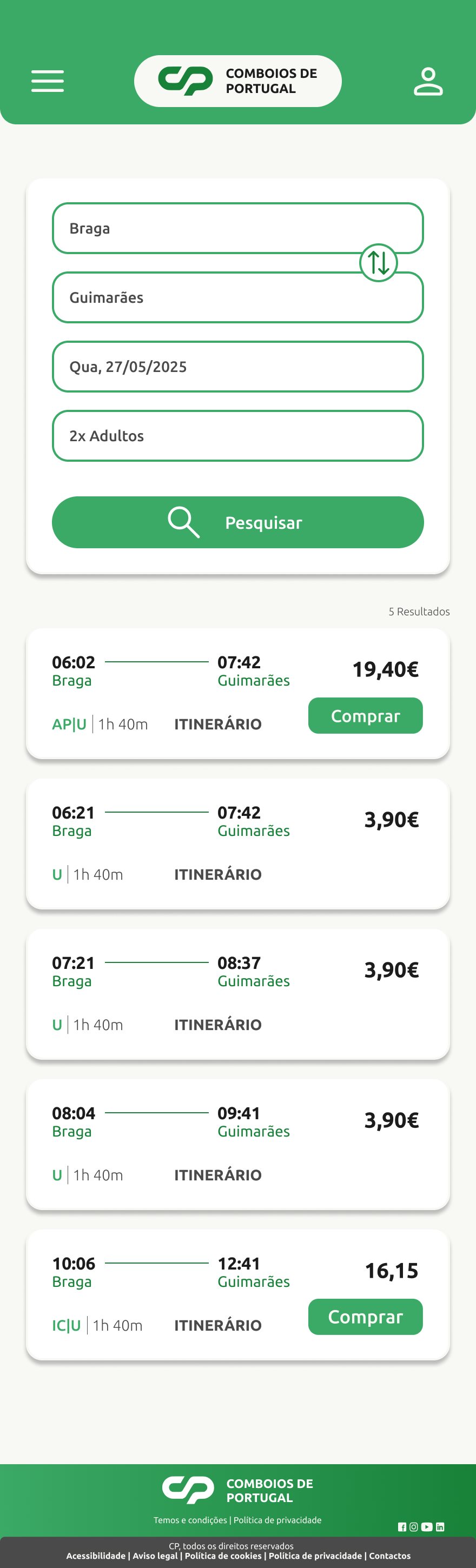
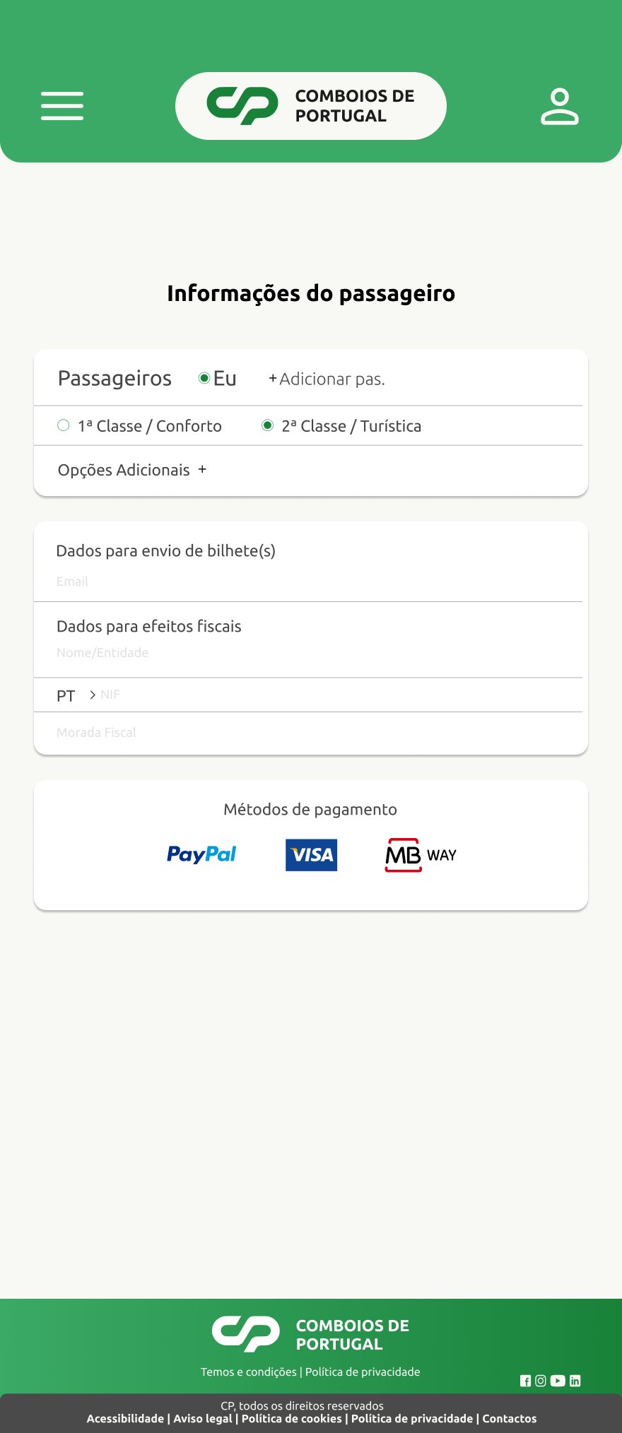
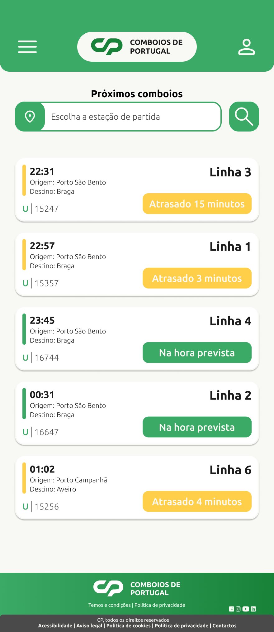
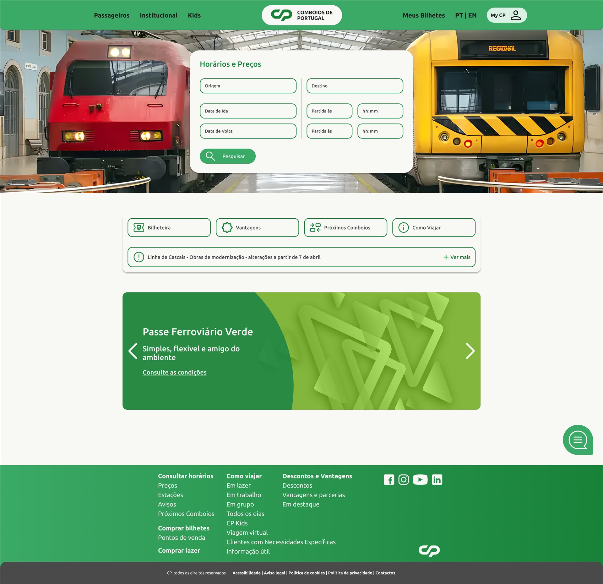
A redesign of the CP website, focused on making ticket search and purchase faster, clearer and easier on any device.
- Type
- Website redesign
- Team
- Pedro Costa, Rafael Medeiros
- Scope
- Research, wireframes, UI
- Platforms
- Desktop & mobile
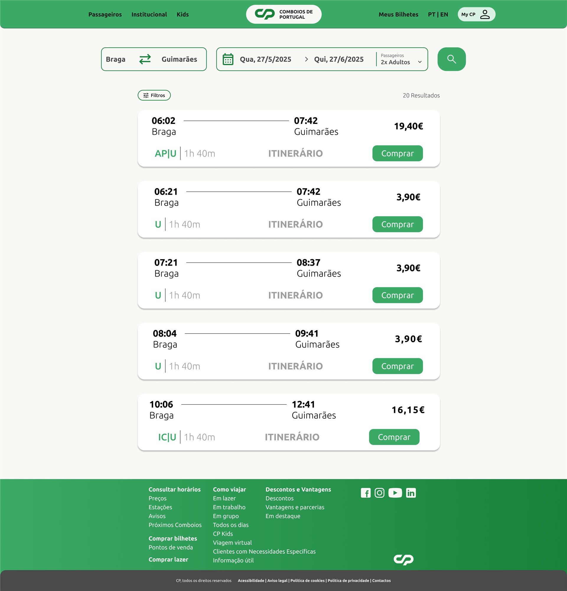
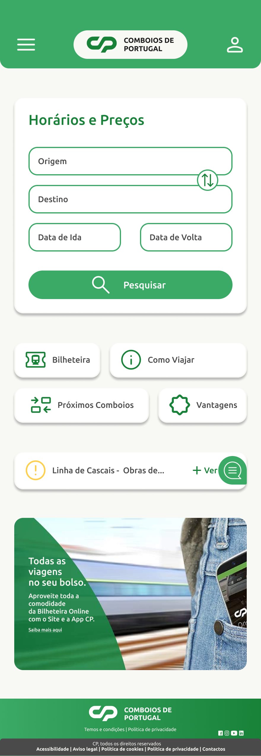
Modernise the CP digital experience
Make the CP website more intuitive, accessible and user-centred, with a focus on mobility and fast ticket purchase.
What the interviews told us
- 01Too much information
Users described the current site as confusing and badly organised, and said they felt lost while navigating.
- 02Paying is the pain point
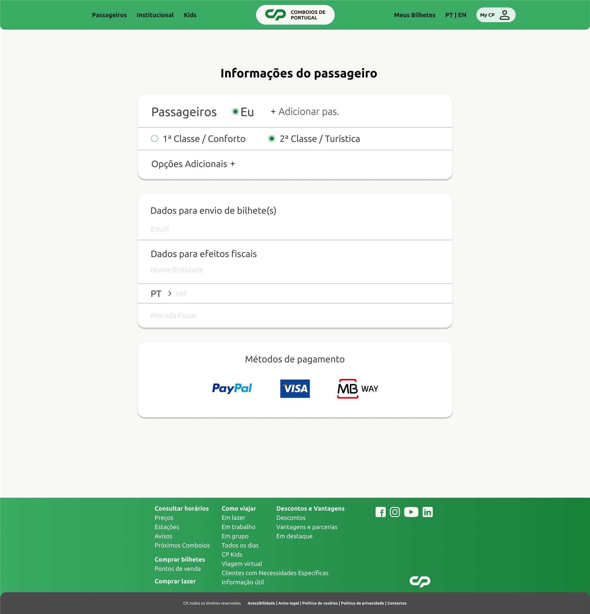
Searching for trips works well; the ticket purchase and payment step was called frustrating.
- 03Mostly on desktop
Most interviewees use the site on a computer, so the desktop flow had to be excellent and the mobile one simpler.
- 04The basics, up front
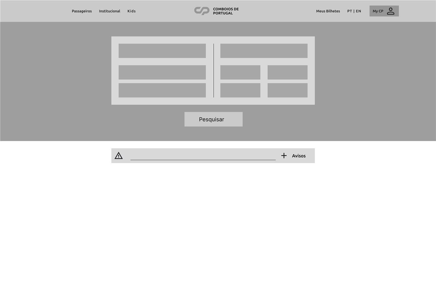
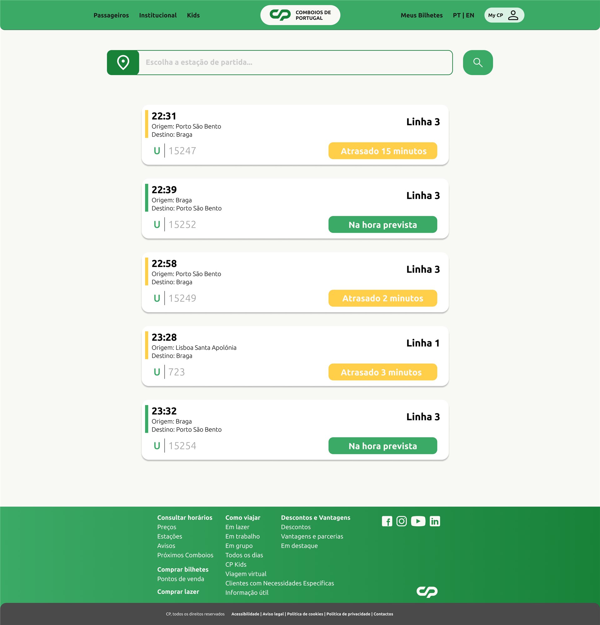
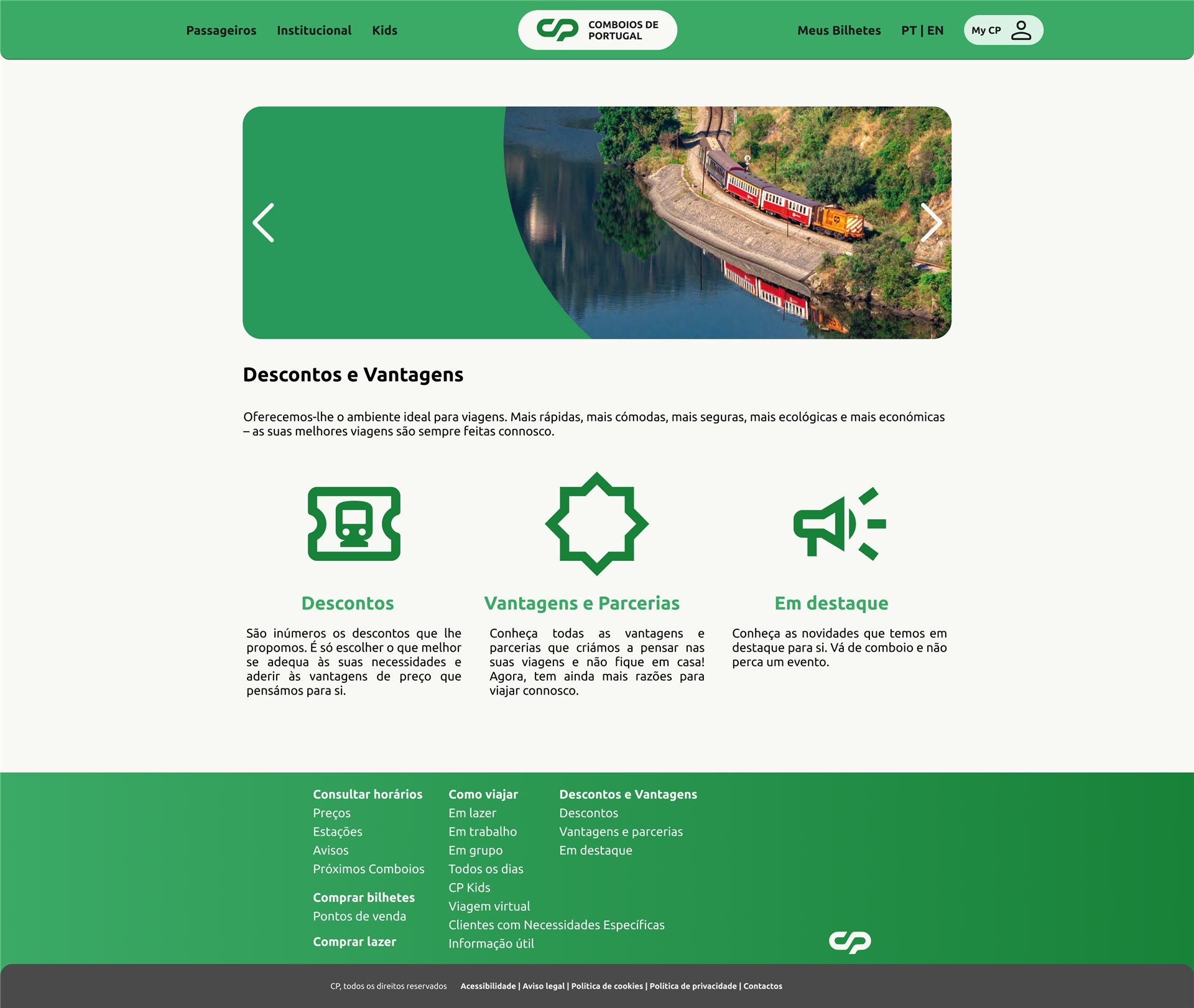
Tickets, destinations, timetables and strike notices on the homepage: the essential pack, without the noise.
- 05FlixBus as the benchmark
FlixBus was mentioned again and again as the transport site people find clear and easy to use.
- 06Keep the brand
The strong green and white contrast was seen as recognisable and worth keeping.
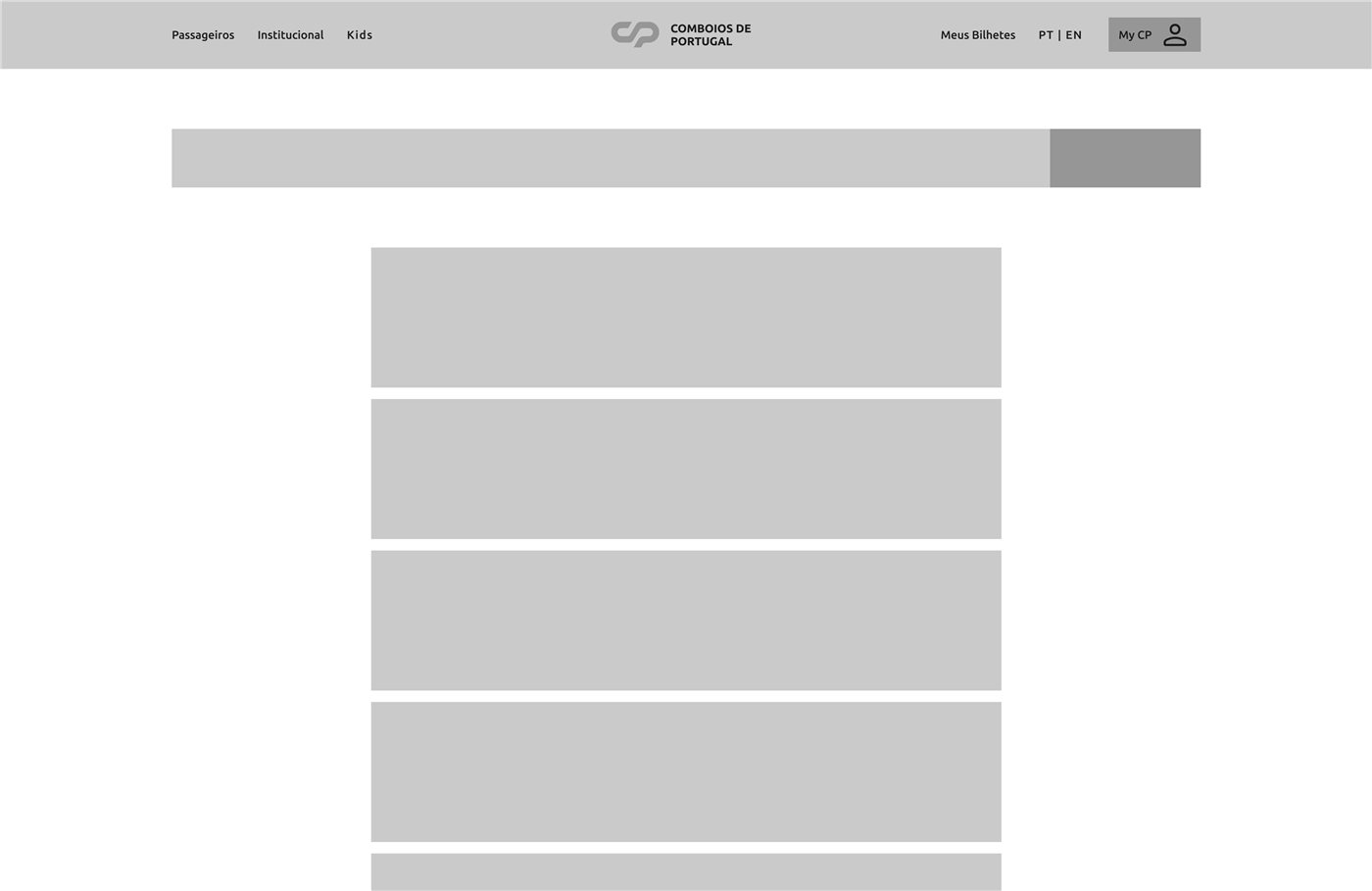
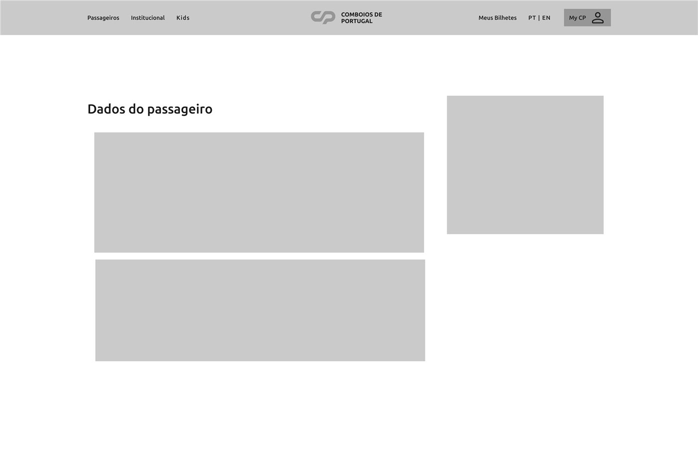
Wireframes
Colour & type
Typeface: Ubuntu — Light, Regular, Medium, Bold
Desktop
Mobile